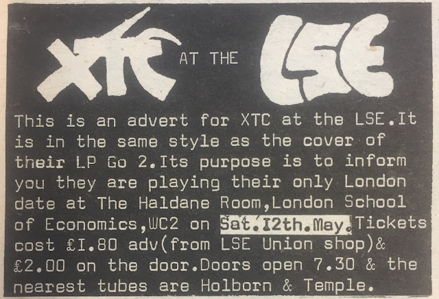
There were a bunch of other permutations - probably a tour poster. Update 1/8/2025 here's a gig announcement advert
The cassette had a different wording, mentioning "cassette inlays" rather than record covers.
When the compact disc was invented, they adapted the text again for that.
And then there was this XTC Go 2 era rarity which Andy Miller posted not so long ago on a social medium
All the handiwork of Hipgnosis, adapting here quite smartly to the New Wave way of doing things, dropping their proggy sub-surreal tableaux thing.
Made me start to look out for other examples of this and so far this is what I've found.
"The Buzzcocks Range of Quality Goods"
Then there was also the Fast Product angle. Here a disagreement about the artwork for Gang of Four's release is documented on the back cover, a gesture at transparency (Bob Last went with a different concept for the front cover).
Last and Fast also put out some non-music releases that were playing with the idea of the commodity, packages filled with clipped out magazine images, pieces of orange peel (soon to rot) and other consume detritus. One called The Quality of Life, the other SeXex.
The idea of "product" being forefronted in the name Fast Product - this here is a commodity that you've purchased - a reveling in the fetishisable husk in which music reached consumers - is something Bob Last copied from New Hormones and Buzzcocks.
The tabloid newspaper packaging of the debut Public Image Ltd single also fits - as does the Vogue style glamour shots on the debut angle.
Or indeed the very idea of presenting yourself as a Limited Company - the band as corporation.
See also British Electric Foundation. And to a degree The Tubes - at least for one album
Perhaps imitating PiL's we are a communications company, not a band idea, World Domination Enterprises talked about becoming a corporation, sparring with the kind of pollution creating multinationals they critiqued in song and protested with their busking tours outside huge corporate office buildings and government institutions involved in environmental destruction.
Other exponents
Sudden Sway - Phil wrote a fascinating essay about Peterborough's finest some years ago. The packaging element was nuts - wasn't one record some kind of board game?
And I suppose the very first to make a stab at this was The Who with The Who Sell Out - although that was a parody of pirate radio, then synonymous with commercials and commercialism, rather than undergroundism as we'd understand it with the subsequent history of pirate radio. The people behind pirate radio in the Sixties were canny entrepreneurs, in favor deregulation, wanting the UK to be like America. Future Thatcherites many of them
Subsequently lamely echoed by Sigue Sigue Sputnik with their attempt to have actual ads as opposed to pretend ones between songs on their album.
Win - formerly The Fire Engines ( again associated with Bob Last, this time with his post-Fast label Pop Aural) - had a whole consume-us, we-are-shiny-baubles, fizzy-drinks to guzzle kind of thing going, which then became (as with Sigue) increasingly humiliated and desperate when no one wanted to buy their particular product. But that was already there in the Fire Engines days too - "Get Up and Use Me", "New Things In Cartons", even "Candyskin" in a way.
Pop as units of stimulation, "modern drugs", disposable buzzes, sugar highs.
But there must be loads and loads more examples
There's a Brechtian term, isn't there? "Expose the device", I think.
Bob Last was a theatre student and Brecht had a big revival in the 1970s.
The Who - it's from Warhol and Pop Art, presumably.
^^^^^^^^^^^^^^^^^^^^^^^^^^^^
Some more recent things in this approximate zone
Imaginary soft drink / pop star from the PC Music squad
And further back in time, The Pop Tarts - American Pet Shops Boys with Baudrillardian hyperconformism / simulation pop elements - named themselves after a sugary treat and talked a fine talk about starting their own line of spin off products - truffles, fragrances what have you (this long before pop stars and rappers routinely diversified and turned themselves into brands). The Tarts were caustic about the pseudo-alternative rock of their day, R.E.M., the illusory concept of authenticity et cetera
Frank Owen (oh think what I could have achieved if I'd had his motormouth pushiness!) browbeat the editors of MM into putting the Pop Tarts on the front cover, with - I think - exactly zero releases to their name at that time.
Not sure if The Pop Tarts ever did any deconstructive artwork though, as I'm not sure they ever released a record....
And there was the whole U2-goes-pomo phase of Pop and "Discotheque" and Bono-as-McPhisto
They did a tour called Popmart and there was some kind of launch event or press release in an actual K-Mart.
Never sounded less convincing or more ill-fitting than in this phase, U2.
Even Rattle n Hum was less undignified, and it was abjectly inapt and jive.
It began with Zooropa, right, this postmodern / we-are-products-in-the-pop-marketplace era?
Whereas Achtung Baby did work, was a valuable loosening up and widening out of U2, after the pious roots-maneuver of Rattle "n' Stinks
After Pop, they had no choice but to rebuild their virginity and go back to their forte, their true lane, with "Beautiful Day" and whatever that album was called.
^^^^^^^^^^^^^^^^^^^^^
Andrew Parker points out the Spiritualized packaging in the style of generic chemist's packet of tablets. Playing cleverly on the old Spacemen 3 idea of music-as-analgesic, "the perfect prescription" etc.
Very clever - "may cause drowsiness"
Now I have this somewhere and I have a feeling I never even opened it, having exhausted my interest in the record with the cassette advance. Perhaps it's valuable? It's probably a bit bashed about in transit, over the years, though.
The compact disc sealed up in a foil sachet like an actual tablet - love it.
The credits styled as pharmaceutical style information, active ingredients, dosage instruction, side effects, warnings etc is very clever
Ed mentions Flipper's play on the generic, off-brand product lines in supermarkets, which was then - he says - ripped off by PiL (if true, perhaps fair enough given Flipper's debts to PiL)
The kind of generic product Flipper have in mind is specifically pharmaceutical - the own-brand medication sold by the likes of CVS and Rite Aid and Target.
And so there is some proto-Spiritualized fun had with this idea on the record labels and the inner sleeve
Probably fancifully, some - Flipper themselves? I'm not sure - thought that Public Image Ltd ripped off the Album idea for Album
I doubt it - I think maybe it's Virgin Records folk memory of XTC's Go 2
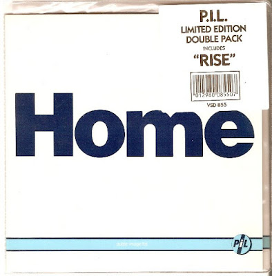
See PiL have the XTC style variants for different formats
However they messed up here I think, since "album" is not a format per see but a type of work, defined by its composition (usually if not invariably multiple tracks) and duration. The cassette and compact disc versions are also albums. They should have called it LP or Long Playing Record or maybe Vinyl LP for total specificity.
Wouldn’t calling a release different things - Album, Cassette, Compact Disc - screw up your chart shop returns and chart position?
Did "Rise" come out as "Single"?
Why yes it did!
And they even copied XTC with the label
But what happened when the second single was released from the album? Was that also called Single? Or maybe Another Single.
Nope they kept the font - and the sort of Sainsbury own brand style design - but they used the song title this time.
.jpg)
I bought the limited edition double-pack version, 2 seven-inches in a gatefold. I guess because "Rise" was included. Can't remember anything about "Home".
]
They missed a trick here - if they had done a couple of new tracks to round it out, they could have titled it EP or Extended Play. Then again, per my comments above about "type of work" versus "format", maybe not.
Flipper got their "own" back with this live album Public Flipper Limited
In a Sudden Sway like gambit, this album can be turned into a board game
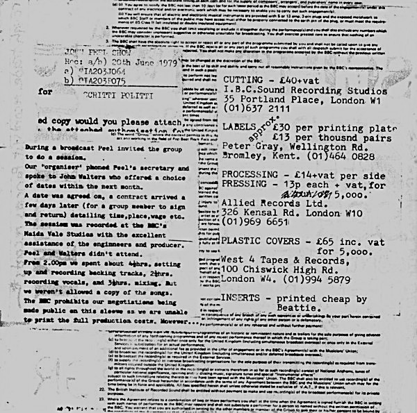
Phil mentions Scritti with the 'how to make your own record' information and recording costs on the sleeves. Does he seriously think that Scritti just slipped my mind? Me, who has been described as a Scritti-stalker!
The Peel Sessions EP (above) actually has the contract they signed with the BBC as the ground on which the demystification info is printed. And for utter transparency there is also a written account, on the left, of how the process went down with the Peel show (within the limits imposed by the BBC, which didn't allow them to discuss the negotiations). This is juxtaposed (on the right) with the ir own production costs for the vinyl EP.
On The Mekons Story, they have a friend of the band reading out snippets from their contract with Virgin in between songs...
Desperate Bicycles fit in somewhere too.
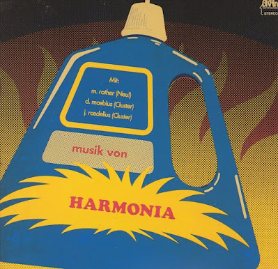
Andrew Parker mentioned these Pop Art we-are-product style covers


.jpg)


Wondering if the back cover of Anomie and Bonhomie (track listing on a crumpled receipt) would be an oblique example of this. Seems very much like something Green Gartside would be interested in.
ReplyDeleteI initially misread the headline as “destructive artwork”. Wasn’t there a band who sold a record in a sandpaper sleeve so it would shred the other albums on your shelf?
ReplyDeleteAh yes: The Return of the Durutti Column.
DeleteBack on topic, Generic Flipper has that intentionally ugly black and yellow design scheme used for off-brand products, intended to reassure consumers that no extra cost has been added on for inessentials like fancy packaging. A concept that was then stolen wholesale by PiL in white and blue for Album.
ReplyDeleteAphex Twin's "Syro" (the last CD I ever bought as it happens) itemises the production/promotion/distribution costs on the cover.
ReplyDeleteScritti Politti's "4 A Sides" did this as well.
DeleteThe Who's "Live At Leeds" sleeve was a mock file that included typed up press releases, a promo photo, memos between the band and their management etc.
ReplyDelete