
No doubt everyone is familiar with this Zardozzy cover.
Hadn't really clocked that there was a whole discography of releases from Westminster Gold with a similar visual pitch presumably aimed at the younger, "with it" generation. The work of a designer called Christopher Whorf.
Lots of cheesecake imagery
That one made me think of Metal Box, of course.
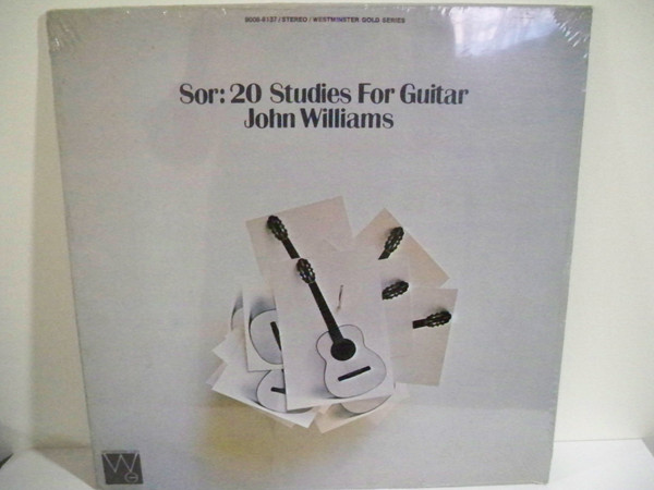
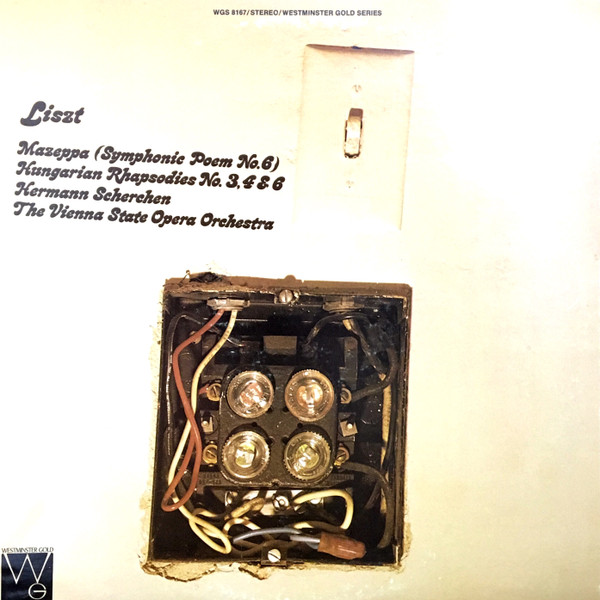
Also visual puns and japes that are vaguely in the vicinity of what Hipgnosis would do, or the Island samplers like El Pea. I'm not totally sure what the joke is with the one below

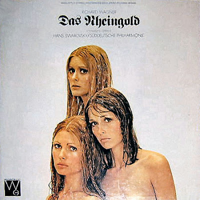
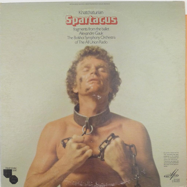
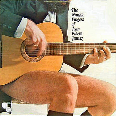
Most of the Westminster Gold are not illustrations or designs but photographs of objects or assemblages

Or it will be a photograph of a person or group of people posed in an absurd or quasi-erotic scantily glad posture or tableau.

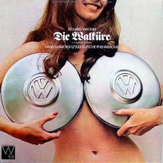
That one combines the cheesecake and the visual pun - "phwooar, take a look at her bust(s)"
Mostly the covers are notable for the well-lit clarity of the photograph, but some go in for a vaseline-on-the-lens blurriness that seems quite modish to the era. This one looks like it could be from an advert for condoms, or perhaps an Emmanuelle-type softcore skinflick.

Even the labels are snazzy and un-classical

Mostly the releases are middlebrow, well-known classical composers and works (I have no idea how well regarded these versions are by cognoscenti). But there's a few oddball and avant inclusions. e.g.

This one below by Professor Emerson Myers of the Catholic University of America (!) was considered sufficiently avant to be Creel Poned. (The vinyl is the only Westminster Gold album I own, I think).


Below you will find an immense number of Westminster Gold sleeves, but it falls a little short of the full set - on Discogs, often I'd click on the promising looking image only to end up with a different, more standard-classical sleeve.


Strong Reggie Perrin energy here.
ReplyDeleteWhat was his company that put out useless products? Grot? Tat?
ReplyDeleteYes it was Grot.
ReplyDeleteOne of Grot's products was a square football, which I can well imagine being featured on one of these covers.
Counterpoint: some of these are pretty good. And often much more faithful to the music than a picture of some boring bloke in black tie. Among the highlights: the Ring cycle, the Gershwin, the Bizet Carmen Suites, Bluebeard's Castle. Some of the sight gags are quite funny, too: the Mozart Requiem, the Anna Moffo arias. There is a whole book on German identity in that sleeve for Die Walküre.
ReplyDeleteOn balance I just want to applaud their ambition for trying to suggest that the Classical music of the past three centuries might have something to say to an audience in the 1970s. Probably a doomed effort. But I can't fault them for trying.
That said, I am also baffled by the Brahms bacon and eggs. A hangover breakfast after you have been Brahms and Liszt the night before, maybe?
DeleteYeah I really like a lot of the covers. Definitely an improvement on the solemn ponderous guff that is often used to illustrate classical music - or the boring landscapes and natural grandeur photos.
DeleteI think you are right about the Brahms and Liszt / pissed greasy breakfast as hangover cure idea.